FURNITUBES
REBRANDING
Furnitubes is one of the UK's leading street furnituremanufacturers and designers. The company has over 70 years of experience producing park and amenity furniture like bollards, cycle stands and litter bins. Their products come in a range of different materials and finishes.
Furnitubes carries out the full process in-house, from design and production to delivery. They design and manufacture everything in the UK and offer standard products as well as bespoke and modular solutions. The existing branding did little to separate Furnitubes from their competitors, so they needed a rebranding to enhance their visibility and market presence.

PROBLEM
The current branding needs to come back to life as it doesn't reflect all the potential they offer and it needs a new way to communicate through engaging visuals and a more contemporary feel. They want to create a new visual and identity to better communicate their expertise and range of products to new potential clients, and to reflect the new modular soul of the company.
CHALLENGE
Furnitubes wanted a rebranding that could be separated and presented in 2 stages: an initial facelift that could temporarily bring more creativity and later a more complete rebranding that could incorporate their new, refreshing direction and could improve and modernise their brand. The main goal was to modernise, revisit and improve their overall look, to give the brand a more lively presence online and offline in order to enhance their appearance.


SOLUTION_PART 1
INITIAL BRAND REFRESH
The initial refresh went though various stages of discovering the company core values and identifying their main audience. They want to reach an adult audience of architects, designers, contractors and stakeholders and communicate their functionality and modularity of shapes and products.
In order to transmit their innovative, creative, unique and dynamic approach, some inspiration has been taken from the shapes that can be found in their products. The typeface choice has been narrowed down to a very clear and clean font: Poppins.
A set of different shapes to be used for socials, brochures, titles and all the different collateral was created and a typography hierarchy was defined to create all the brochures and brand presentations. A big dot, as a full stop, has been added at the end of each title to represent the cylindric shape of a tube of the Furnitubes logo. Colours and shapes were used more prominently for both online and offline branding; the shapes can be frames for pictures, or to highlight titles in presentations and posters.
Colour palette and logo were kept the same for this initial brand refresh.


SOLUTION_PART 2
FINAL REBRANDING
After the initial brand refresh and the complete research about the company values and goals the next step was to complete the actual revamp of the branding.
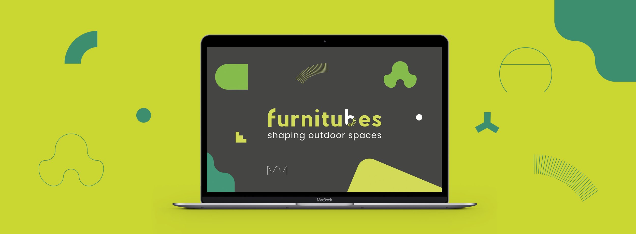
The previous logo has been replaced by a much stronger, bolder typography that capture the attention. It’s clean and it still appeals to the same audience but it now looks less outdated. The logo has been redesigned using the company typeface and the letter “F” has been redesigned using a rectangular and semicircle shape from the brand shape library.
Alongside the revamped logo, a suite of new elements and colours have been introduced including new colours, colours schemes, new shapes and patterns.
While the typefaces stayed the same from the initial rebranding, the colour palette has been expanded with more green and grey shades. The number of the shapes used in the graphics have been slightly increased taking inspiration from some of the products.

More colourful illustrations accompany the brand and shorts animations for videos and podcast, give a more dynamic look to the brand.
Posters, brochures, catalogues and various stationery were rebranded and redesigned completely following the new branding guidelines. Social media has been updated as well and presents a new colour combination and bespoke icons for the highlights.
In the Head Office in London Bridge a mural has been hand painted and it represents a sort of "Urban Jungle" where animals are living in the city and are walking , cycling or are using Furnitubes products. Similar illustrations and animals have been used to create branded goods like mouse mats, water bottles and coffee cups.


