CAKE LAB
Francesca Maroni creates mouth watering, lavish cakes that she was originally promoting on her social media account. After receiving a lot of positive feedback, and beginning to get commissions, she decided that she needed proper branding to create her image and push her creations to the next level. The cakes she produces are the result of a lot of research and study with Michelin star professionals; she needed a brand that could be recognised everywhere and reflect the high level of expertise and skill she devotes to her work.

CHALLENGE
After an initial analysis of the market and the target audience, it was clear that the brand needed to establish itself as a new type of product that merged the professional quality of the baking with the essence of a home made treat.
For Cake Lab, one of their priorities is creating beautifully designed cakes that can instantly be distinguished from a lesser quality product. In addition to this, the great taste goes back to the original recipe her grandmother came up with many years ago. The aim of the branding is to make her business more accessible to potential clients, restaurants and bakeries that would like to collaborate with her in the future.
The brand is positioned as a new niche that would fuse tradition, art and creativity. The cakes are a special product that are both a treat for the eyes and a treat for the taste buds. They are perfect in the way only something that was handmade can be, the complete opposite of a mass produced product from an industrial chain.

SOLUTION
The main idea to achieve for this project was to transmit the main concepts of her work, that could be narrowed down in the craft of her professional design. The main challenge was to achieve something in between elegant and handmade, a balance between simplicity and haute cuisine.
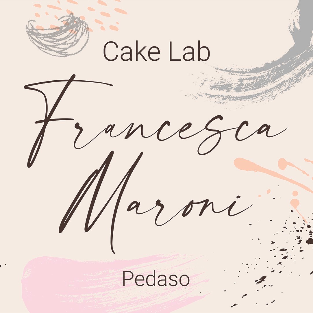
The logo is inspired by signatures of chefs, and for this reason the signature of Francesca has been taken and used as the main logo after a few changes to make it more legible and readable. The name and surname is easy to remember for people that already follow her - a small circle of friends and followers that is growing rapidly. A modern and clean typeface has been used as the voice of the brand for all the collateral and advertising.
Some elements have been added, such as decorations to represent powdered sugar, swirls for decorations, chocolate splatters that create patterns and brush strokes that are reminiscent of artistic brushes on a canvas. The colour palette uses soft colours, subtle decorations and a swirl garnish in the background, and have been studied by looking at the creations of pastry chefs that sometimes look like artistic sculptures.